Case Study: Greenlight Invest Redesign
The Challenge: Engagement Gap
Services: Copywriting, content strategy, UX research
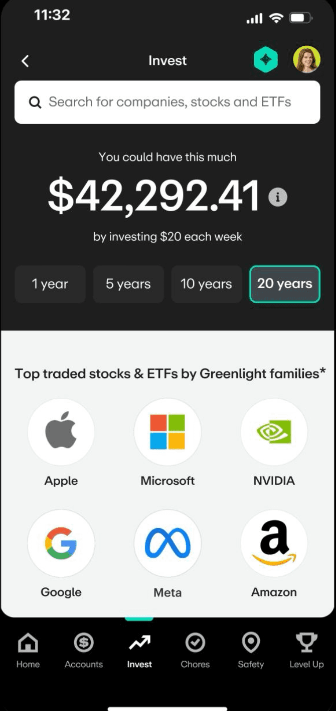
Despite Greenlight’s position as a leader in family finance, internal data revealed a significant friction point: only 1.6% of parents were actively placing trades within the app. While the platform was built for families, the investing feature was failing to convert the primary account holders — the parents.
The Strategic Hypothesis
Our UX research suggested that the existing investing interface felt too individualistic or intimidating for the average user. We hypothesized that by shifting the value proposition from "personal trading" to "family-centric investing," we would lower the barrier to entry, driving both trade volume and Max plan upgrades.
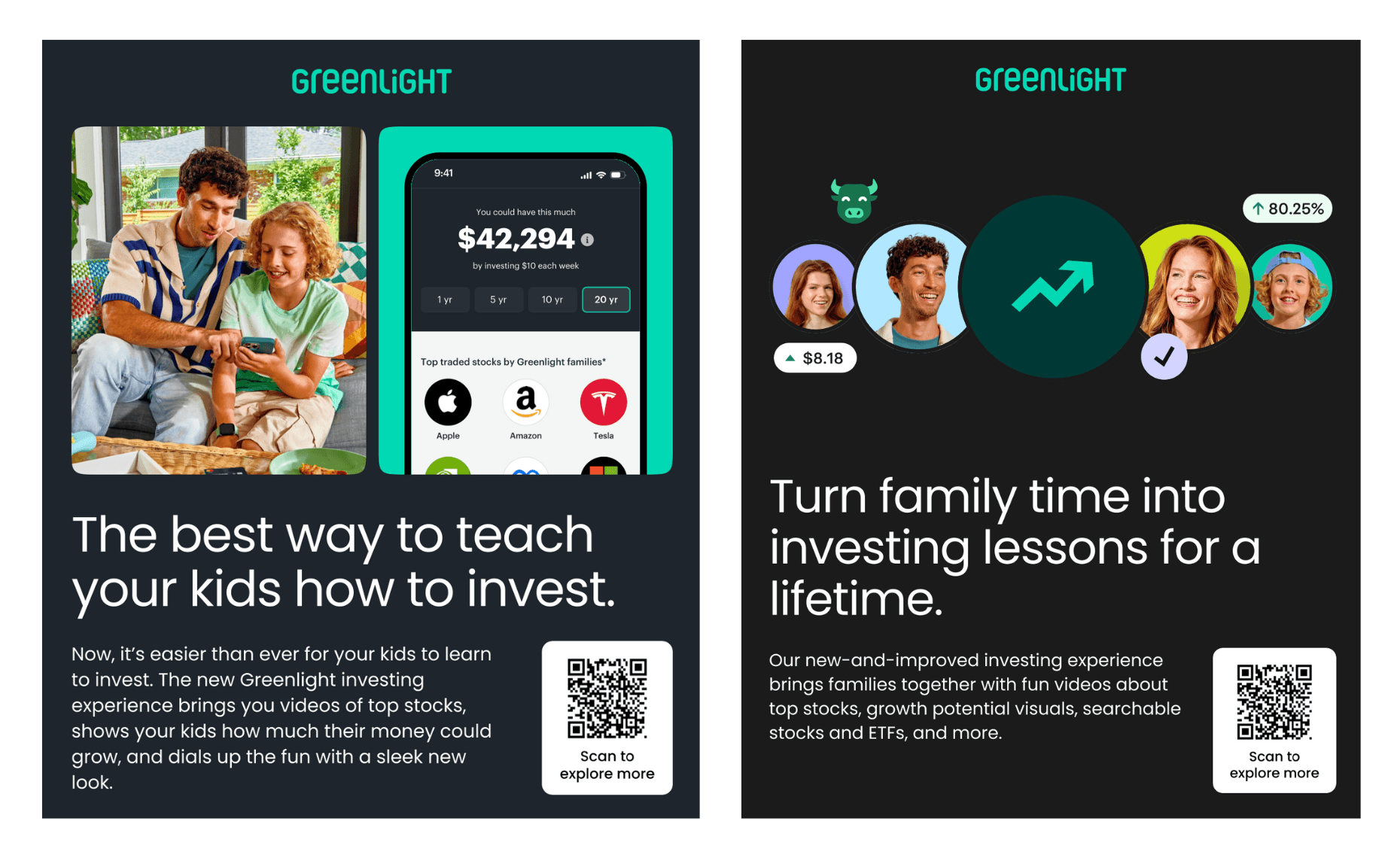
The Experiment: "Instruction" vs. "Participation"
We ran an A/B test to determine which psychological lever best motivated parents to start their investing journey.
Test 1: "The best way to teach your kids how to invest." Test 2: "Turn family time into investing lessons for a lifetime."
The Final Verdict: Mentorship Over Membership
While both "family" hooks significantly outperformed the control, the educational angle (Test 1) was the runaway winner, outperforming the "collaborative" messaging of Test 2 by 51.8% in relative lift.
This suggests that for Greenlight parents, the value proposition of financial mentorship ("Teach your kids...") is a much stronger conversion driver than shared activity ("Invest as a family"). By framing the trade as a teaching moment rather than a group task, we didn't just see an 85% improvement — we unlocked a 129% surge in engagement and Max Tier upgrades.